CASE STUDY
A Modern Brand to Reflect Community, Energy & Motion
Book Industry Study Group
Case Study: Visual Identity System
Creating an Engaging New Visual Identity for the Book Industry Study Group
The Book Industry Study Group, a trade association based in the United States, recognized the importance of revitalizing its image within the publishing industry. To achieve this, we collaborated on an endeavor to develop a captivating branding strategy that would accurately convey the organization’s authority, influence, and the value of its services and committee work.
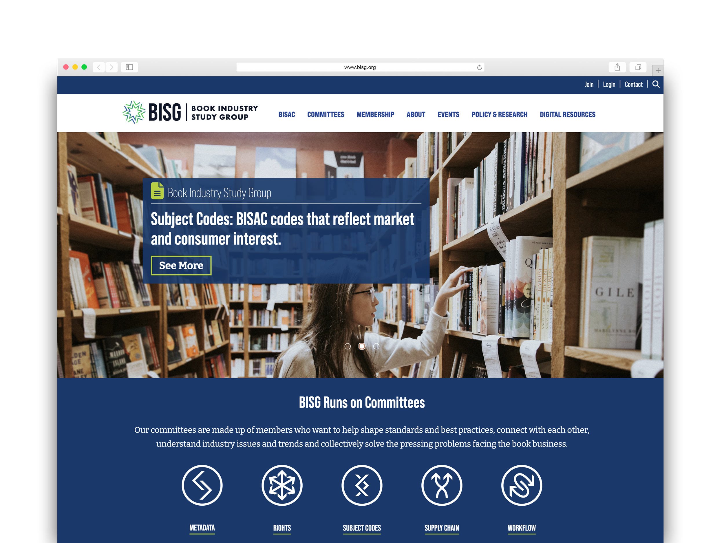
The new design is more open, engaging, and professional, while the site's updated architecture has been an immediate hit.
— Brian O’Leary, Executive Director, Book Industry Study Group
Linda’s team's in-depth research guided a full revision of the site's information architecture. The result: a web site that members and non-members understand and can easily navigate, leading to more product access, increased downloads of BISG resources, and higher satisfaction among site users.
— Brian O’Leary, Executive Director, Book Industry Study Group
Bringing the Brand into the 21st Century
Through our ecosystem evaluation, the Studiolo Secondari creative team identified key items for the BISG brand to convey, including:
Modernity and vibrancy
Standard-bearing authority in publishing
Collaboration and connectivity
Emphasis on accessibility
Now, how to create a visual identity that embodied these important brand traits while remaining definitive and dynamic? The image of a book comes to mind when thinking of a publishing group — but at the same time the image of a book may seem dated and negate the modern image desired.
The key was to focus on the connectivity of the brand, the only of its kind to bring together all aspects of the supply chain, as well as its access to experts in the community, and its compendium of industry resources.
After collaborating with the creative team on visual identity designs, we kicked into stakeholder engagement. Studiolo Secondari negotiated with organizational stakeholders, including board members, to approve design concepts, distill often divergent feedback, and move the creative process forward toward a successful conclusion.
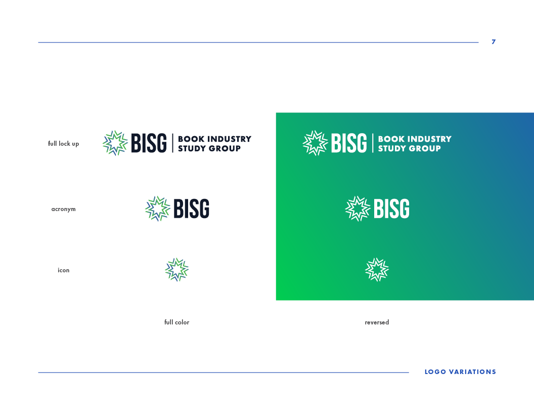
Ultimately, the creative team brought these design concepts to life, developed a brand system, and created a promotional launch video to showcase the new BISG visual identity.
Results:
An engaging BISG visual identity that is refined, reflected in its classic proportions and geometries; dynamic, reflected in its color gradation and shape shifting; and innovative, reflected in its active tension between the past and the future.
With this vibrant new logo as the centerpiece, Studiolo Secondari also updated the BISG website to allow for easier accessibility and a stronger information architecture. Ultimately the BISG walked away with a vibrant and modern visual identity, applied across branding channels, with full board member approval to boot.


