CASE STUDY
Revitalized Branded Publication System
The Organization for Economic Co-operation and Development (OECD)
Case Study: Branded Publication System
Using Vibrant Design to Make Complex Content Accessible, Compelling, + Relevant to Readers
OECD needed a revitalized publication design system customized to their brand. We absorbed their mission, translated it into the form of an accessible, vibrant design approach, and applied it to the organization’s multifaceted content, creating clear guidelines on how this should be used for future print and digital publication.
For this project, Studiolo Secondari leaned into our “superpower” of insightfully and authentically applying brand themes to publications—in this case, the OECD’s print and digital publication system.
We absorbed the OECD’s mission, translated it into the form of an accessible, vibrant design approach, then applied it to the organization’s multifaceted content.
As a result, content became easier for readers to navigate—now they could visually “snack” on information, skimming and circling back as needed—with enhanced accessibility to yield maximum impact for a diverse global audience.
After collaborating with Studiolo Secondari, the OECD walked away with a revitalized publication design system customized to their brand as well as clear guidelines on how to apply the dynamic design approach to future print and digital publication.
Creating an Accessible, Vibrant Design Approach
The process of developing a systemic design approach for all OECD publications kicked off with a sector ecosystem evaluation. After investigating comparable institutions (like the European Economic Forum) and assessing their publications, some key benchmarks emerged, including:
Legibility: clean and open page design
Accessibility: font selection based on readability in print and digital, bolstered by language support
Content navigation system: to support skimming and following content pathways
Accessibility
Of these benchmarks, perhaps most important to the OECD was accessibility—a crucial factor in extending its influence and reach. As such, the design approach we developed needed to be:
Translatable across a range of Latin and non-Latin languages for readers of all capabilities
Compliant with web content accessibility guidelines for both font selection and color palette (WCAG)
Enjoyably readable in digital and print environments
Compelling + relevant design
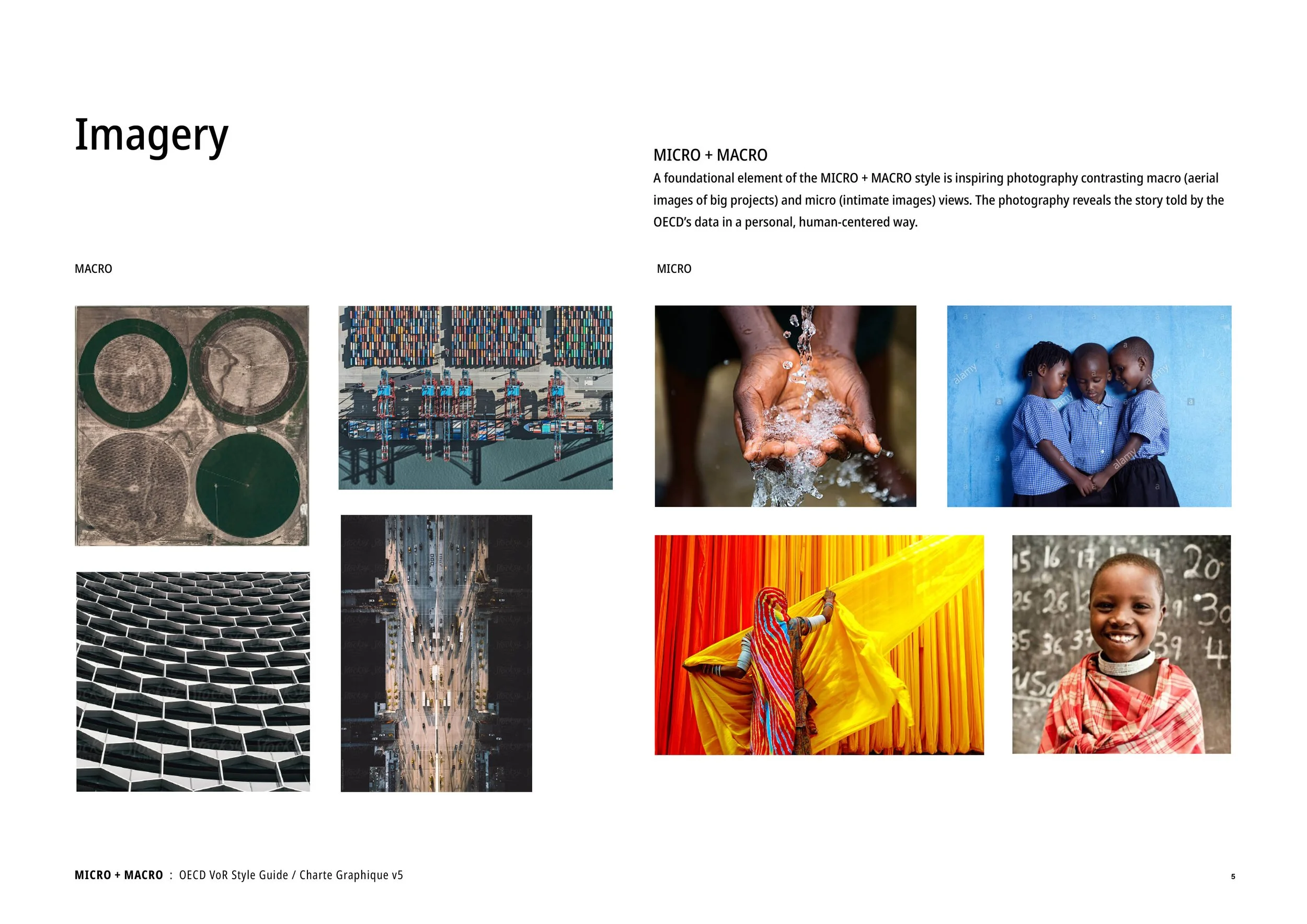
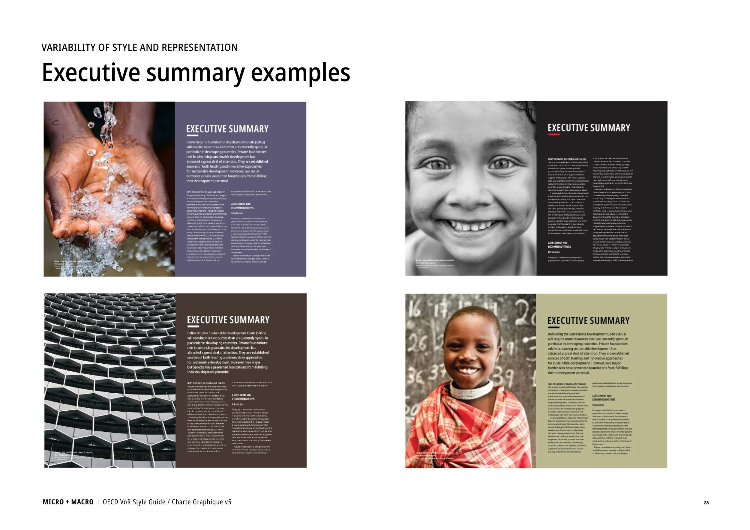
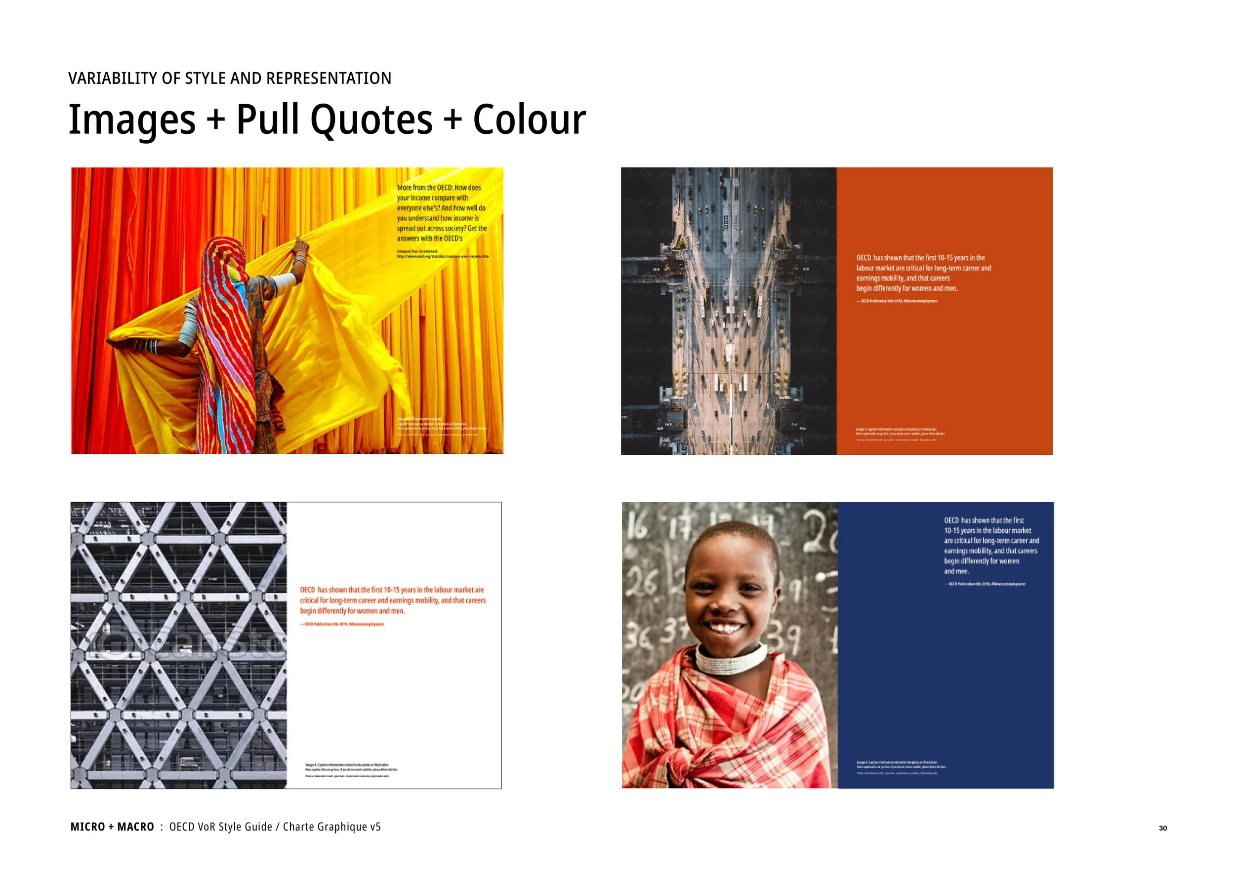
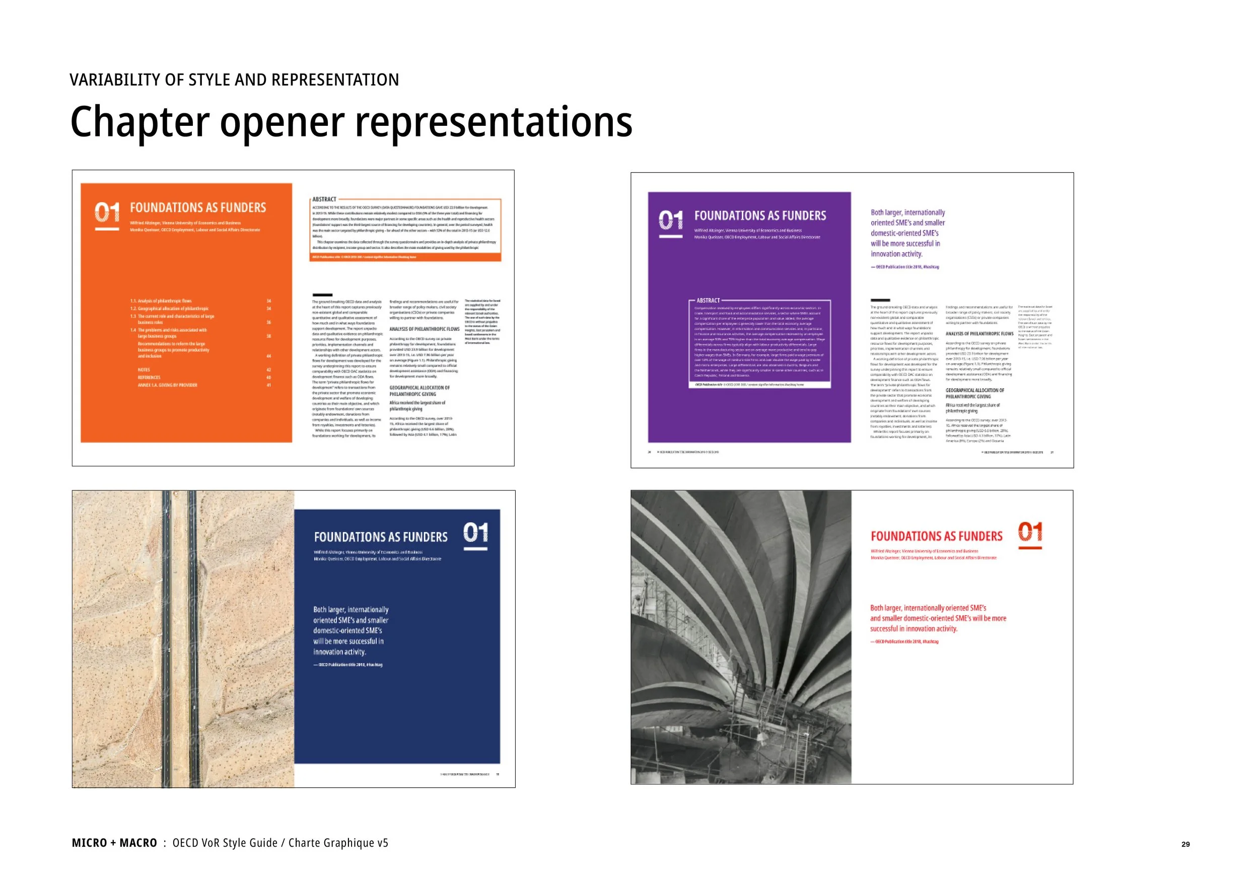
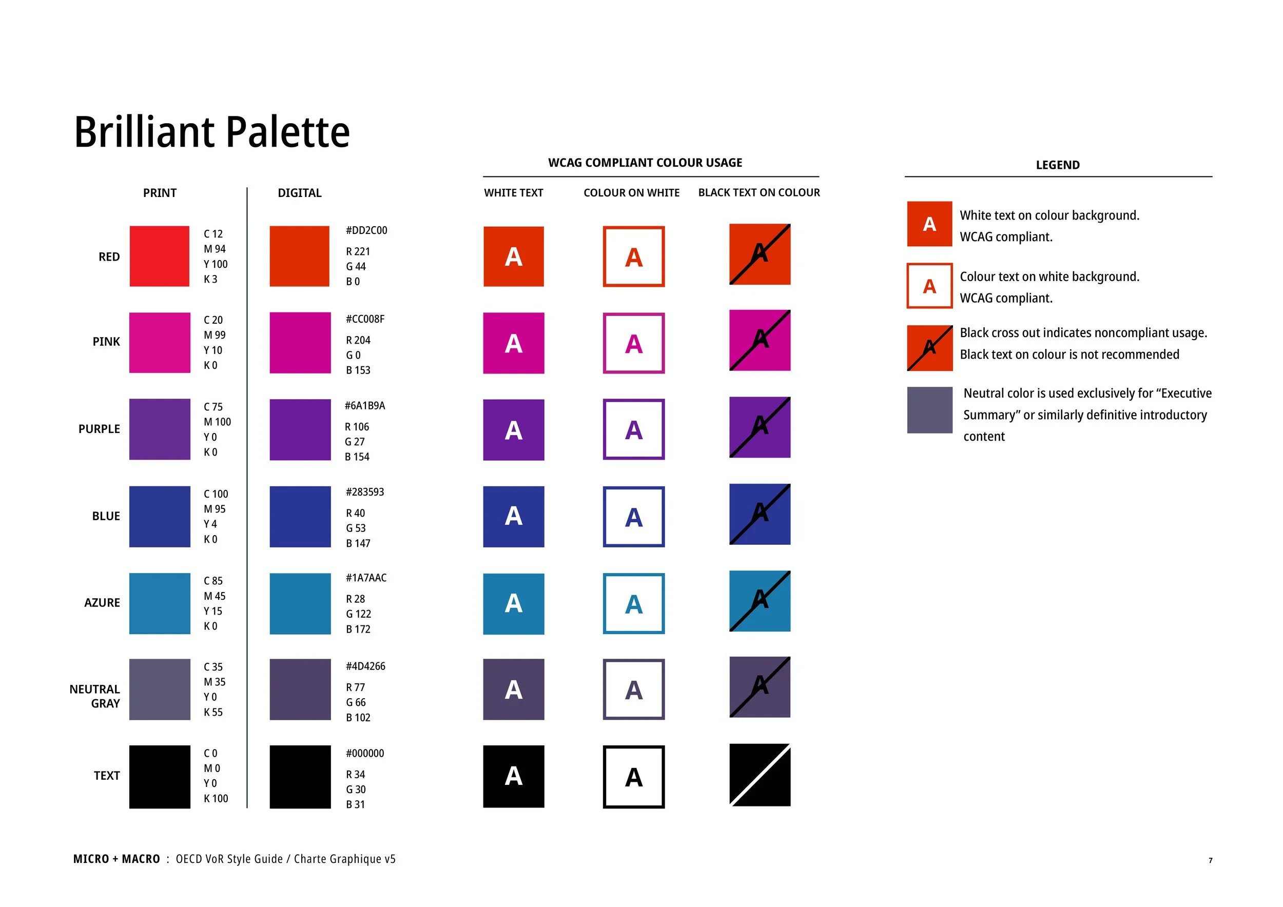
And of course, the design also needed to be visually sophisticated enough to adequately support the OECD’s premier research content. For this reason, we developed the Micro + Macro design approach, which included photography, a vibrant color palette, and a dynamic layout. This text system included:
Micro + Macro photographic narrative: Contrasting macro photography of significant industrial projects that represent OECD economic data with personal micro portraits of individuals impacted by the data to reveal its human-centered effect
Vibrant color palette: Supporting reader engagement and wayfinding by using a strong, bold color palette to energize the publication’s pages with dynamic highlighting of important information
Integrating the OECD brand: Leveraging the OECD brand’s authority with graphic motifs from the branding package, such as angles, chevrons, and brackets, to guide readers along content pathways
Design toolkit: Using graphics, case boxes, photography, and pull quotes to make statistically dense content more skimmable and social media-friendly for increased influence
Ms. Secondari is a individual with a remarkable range of talents. As a designer Linda's aesthetic sensibilities, impeccable taste, and good judgement are second to none. Whether the project involves a book interior, jacket or cover, web site, branding effort, or a promotion piece Linda's work invariably demonstrates her ability to deliver work of breathtaking quality on budget and certainly no less important, on schedule.
— David Hetherington, VP Global Business Development, Books International Inc.


